
HTML will never be the same with the new <dialog> tag.
❌Before:
See how much work it would have taken me to create a dialog 👇
Almost 20 lines of CSS alone:
And that’s just CSS for the dialog functionality — it will still look very basic:
But how about with the new <dialog> tag!
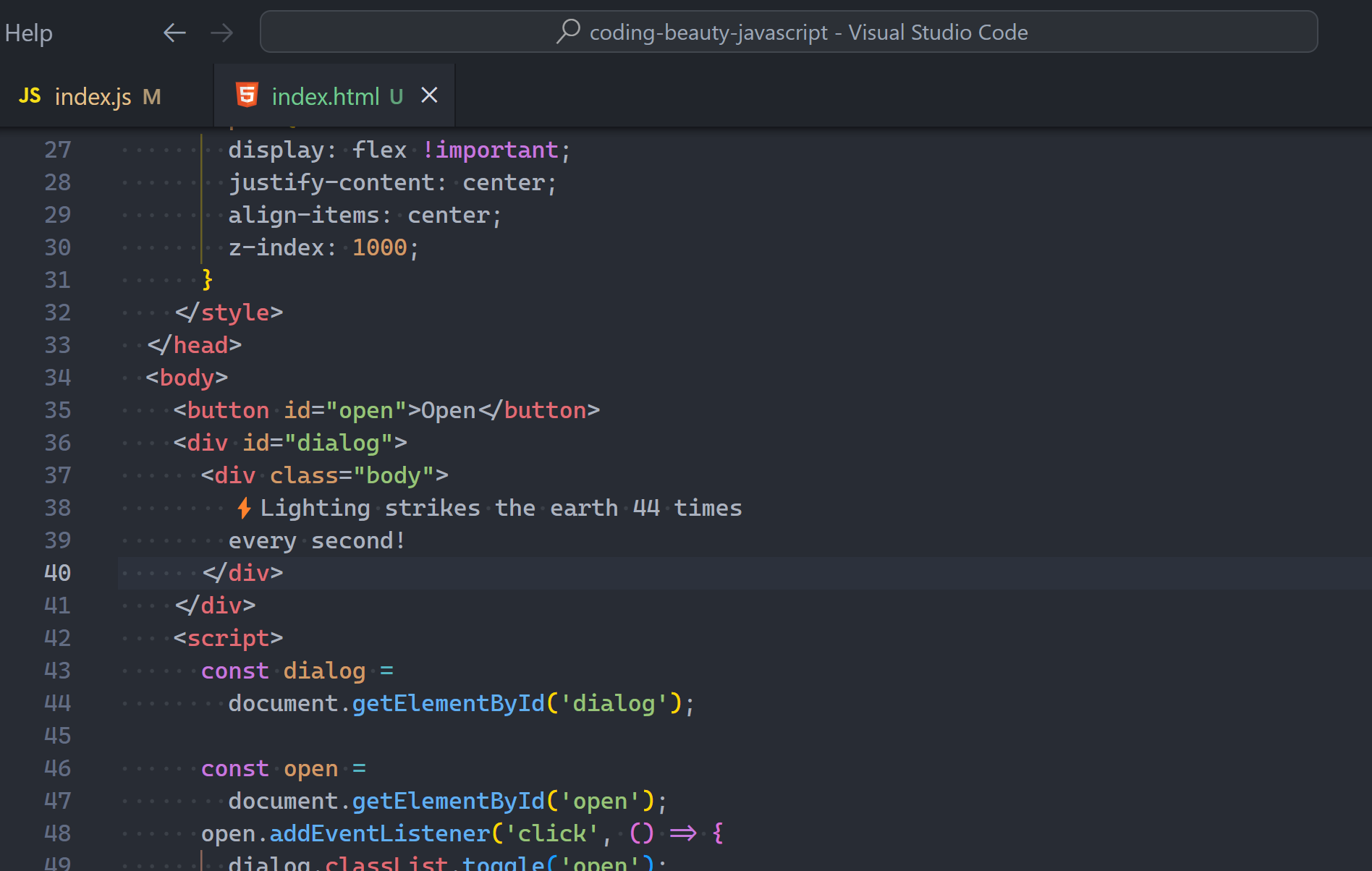
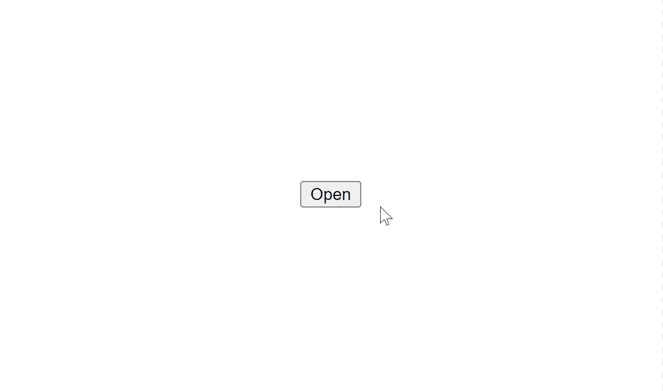
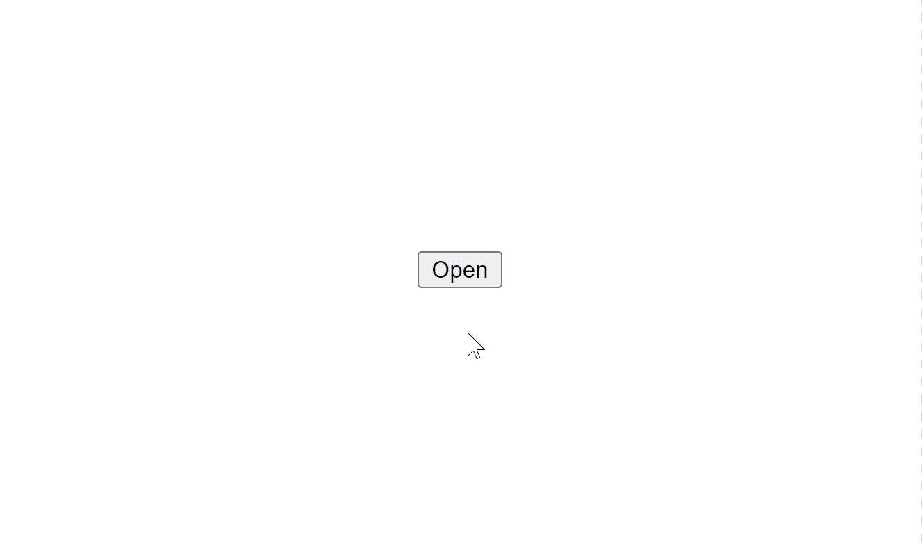
✅ Now:
<button id="open">Open</button>
<dialog id="dialog">
  ⚡Lighting strikes the earth 44 times every second!
</dialog>const dialog = document.getElementById('dialog');
const open = document.getElementById('open');
open.addEventListener('click', () => {
dialog.showModal();
});We can even use the show() method to show a non-modal dialog — less intrusive with no backdrop:
const dialog = document.getElementById('dialog');
const open = document.getElementById('open');
open.addEventListener('click', () => {
  dialog.show();
});
Dialogs have always been a powerful way to forcefully seize your user’s attention and slam information in their faces.
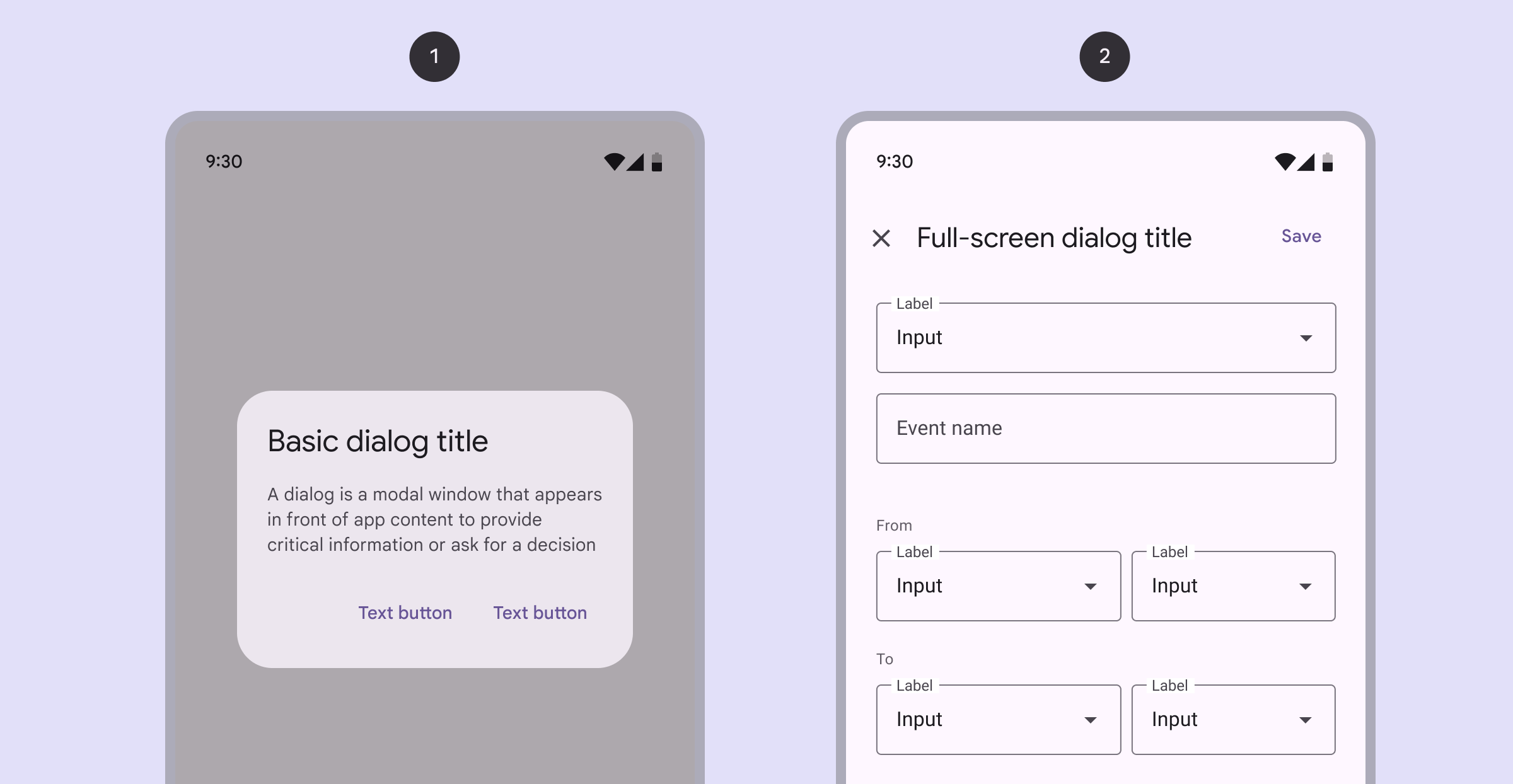
It’s been a staple feature of every UI design system from Material Design to Fluent Design.
But even as common as they are we always had to resort to third-party libraries or create custom components to use them.
And many of these libraries don’t even follow the official recommendations for usability & accessibility…
Example: pressing the Escape key should dismiss the dialog on the page — but this doesn’t happen for many custom dialogs.
So <dialog> changes all that.
Auto-open dialog
The open attribute keeps the dialog open from the moment you open the page:
<dialog id="dialog" open>
  Giraffes are much more likely to be
  struck by lightning than humans are.
  In fact, they're 30 times more likely
</dialog>
Auto-close button
Yes, you could add close functionality with standard event listeners and the close() method:
const close = document.querySelector(
  '#dialog .close'
);
close.addEventListener('click', () => {
  dialog.close();
});
But the built-in <dialog> makes this even easier — no JavaScript needed:
<dialog id="dialog">
  ⚡Gain essential coding skills & knowledge at
  codingbeautydev.com
  <br />
  <form method="dialog">
    <button class="close">Close</button>
  </form>
</dialog>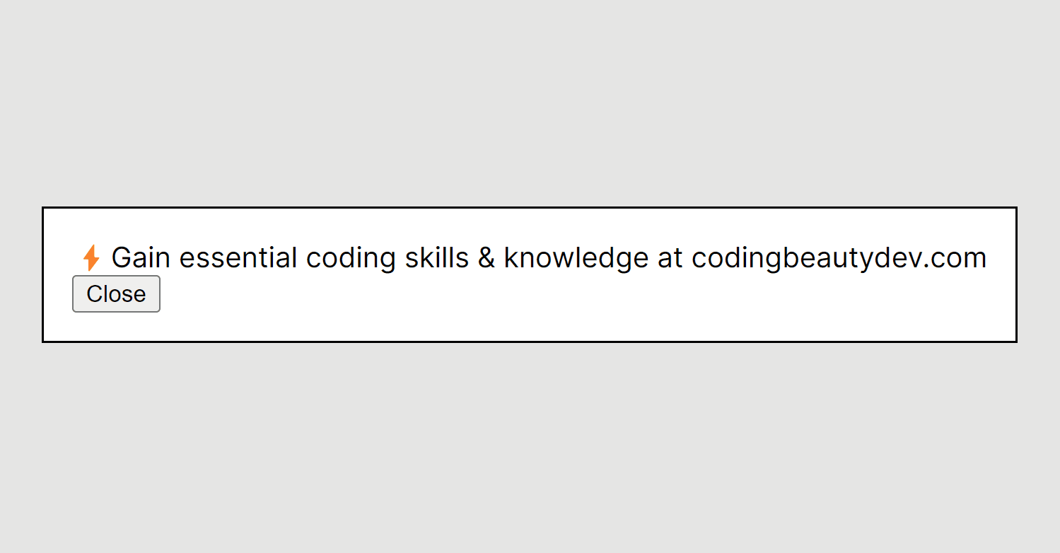
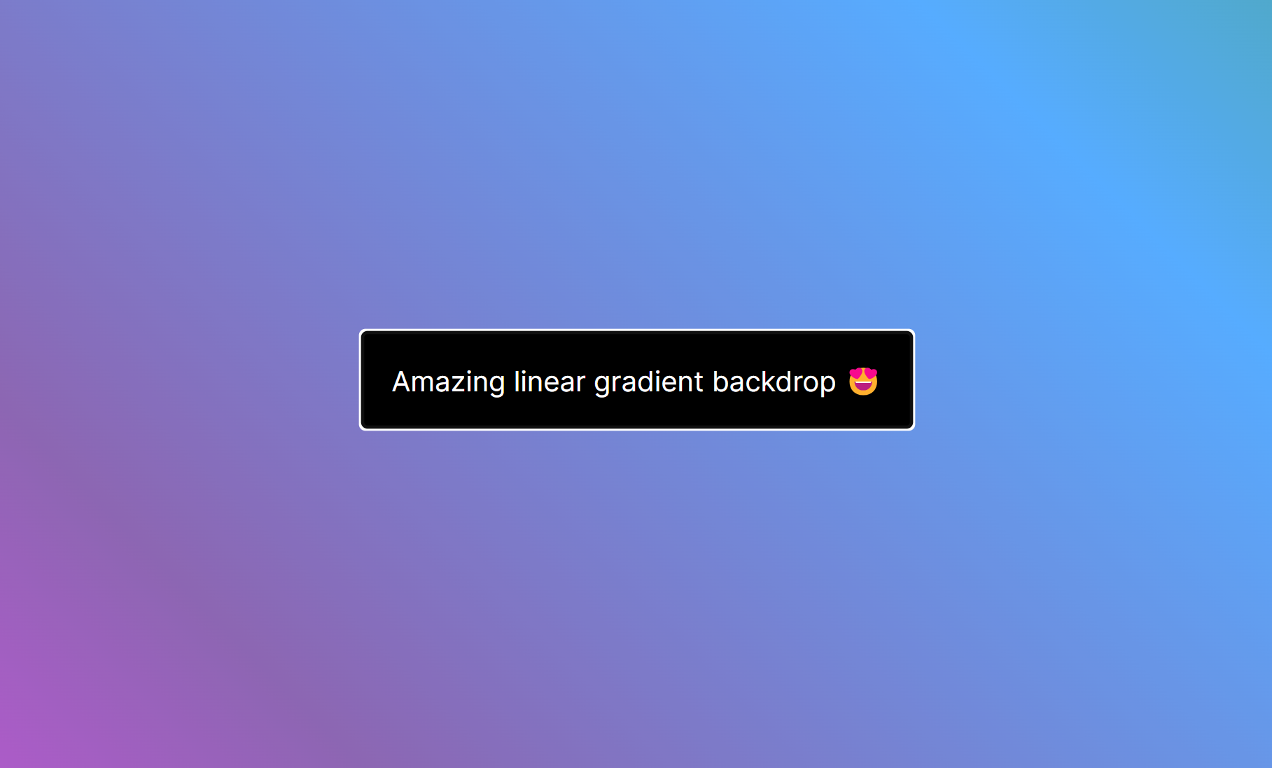
How to style <dialog> the right way
<dialog> has a special ::backdrop pseudo-element for styling the backdrop:
::backdrop {
  background-image: linear-gradient(
    45deg,
    magenta,
    rebeccapurple,
    dodgerblue,
    green
  );
  opacity: 0.75;
}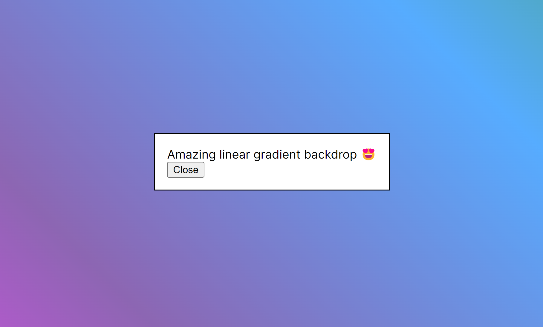
Styling the main element is straightforward:
dialog {
   background-color: black;
   color: white;
 }
Final thoughts
With the new HTML <dialog> tag, creating modals and dialogs in our web apps has never been easier and faster.
11 Amazing New JavaScript Features in ES13
This guide will bring you up to speed with all the latest features added in ECMAScript 13. These powerful new features will modernize your JavaScript with shorter and more expressive code.
