css

New native nested CSS feature in 2024: An absolute game changer

The new native nested CSS feature changes everything for frontend development and makes SASS & LESS useless.
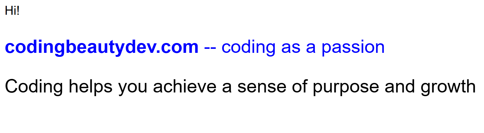
❌ Before:

How would you style the nested elements in this HTML?

HTML
<section> Hi! <div> <p><span>codingbeautydev.com</span> -- coding as a passion</p> Coding helps you achieve a sense of purpose and growth </div> </section>

You’d normally stress yourself and waste a lot of time repeating the outer element names.

No wonder SASS and LESS became so popular.

CSS
section { font-family: Arial; } section div { font-size: 1.5em; } section div p { color: blue; } section div p span { font-weight: bold; }

✅ But now: with native CSS:

CSS
section { font-family: Arial; div { font-size: 1.2em; p { color: blue; span { font-weight: bold; } } } }

So much cleaner and easier. All the styles are now encapsulated together instead of being scattered all over the place.

As intuitive as encapsulation in object-oriented programming:

JavaScript
// ❌ redundancy const personName = 'Tari Ibaba'; const personSite = 'codingbeautydev.com'; const personColor = '🔵blue'; // ✅ encapsulate field class Person { name = 'Tari Ibaba'; site = 'codingbeautydev.com'; color = '🔵blue'; }

In some browsers, you’ll need to use &:

CSS
section { font-family: Arial; & div { font-size: 1.2em; & p { color: blue; & span { font-weight: bold; } } } }

What about classes and IDs?

What if you wanted to style nested elements by their class or id attribute?

HTML
<section class="class1"> Hi! <div id="id1"> <p class="class2"> <span id="url">codingbeautydev.com</span> -- coding as a passion </p> Coding is cognitively challenging and mentally stimulating </div> </section>

The nested CSS will be quite similar:

CSS
.class { font-family: Arial; #id1 { font-size: 1.2em; class2 { color: purple; #url { font-weight: bold; } } } }

It also works with sibling selectors:

CSS
div { section { + p { color: blue; ~ p { color: red; } } } }

Pseudo-classes and elements

Yes:

CSS
button { background-color: blue; :hover { background-color: yellow; } }

Media queries

Another huge selling point of nested CSS:

❌ Before:

Creating media queries was messy and the query styles and main styles for an element were separated:

CSS
.hamburger { display: none; } .header { font-size: 40px; } @media (orientation: landscape) { .header { font-size: 32px; } @media (max-width: 480px) { .hamburger { display: block; } .header { font-size: 24px; } }

✅ Now:

It makes more intuitive sense for the element styles to contain query styles — than for the query styles to contain small segments of the element styles.

Nested CSS lets you do this easily:

CSS
.hamburger { display: none; @media (max-width: 480px) { display: block; } } .header { font-size: 40px; @media(orientation: landscape) { font-size: 32px; } @media(max-width: 480px) { font-size: 24px; } }

With native nested CSS you can create styles in a more intuitive manner.

SASS is practically useless now — especially now that we also have native variables in CSS:

CSS
$base-font-size: 16px; $gutter-width: 10px; .container { padding: calc($gutter-width * 2); // Use calc with Sass variable font-size: $base-font-size; } .heading { font-size: calc($base-font-size * 1.5); // Modify base font size with calc }

Recreate the Material Design text field with HTML, CSS, and JavaScript

No doubt you’ve seen the beautiful text field if you’re one of Gmail’s 2 billion active users:

It’s fluid, it’s intuitive, it’s colorful 🎨.

It’s Material Design: the wildly popular UI design system powering YouTube, WhatsApp, and many other apps with billions of users.

Let’s embark on a journey of recreating it from scratch with pure vanilla HTML, CSS, and JavaScript.

1. Start: Create basic input and label

As always we start with the critical HTML foundation, the skeleton:

The text input, a label, and a wrapper for both:

HTML
<!-- For text animation -- soon --> <div class="input-container"> <input type="text" id="fname" name="fname" value="" aria-labelledby="label-fname" /> <label class="label" for="fname" id="label-fname"> <div class="text">First Name</div> </label> </div>

2. Style input and label

I find it pretty satisfying: using CSS to gradually flesh out a stunning UI on the backs of a solid HTML foundation.

Let’s start:

Firs the <input> and its container:

CSS
.input-container { position: relative; /* parent of .label */ } input { height: 48px; width: 280px; border: 1px solid #c0c0c0; border-radius: 4px; box-sizing: border-box; padding: 16px; } .label { /* to stack on input */ position: absolute; top: 0; bottom: 0; left: 16px; /* match input padding */ /* center in .input-container */ display: flex; align-items: center; } .label .text { position: absolute; width: max-content; }

3. Remove pointer events

It resembles a text field now, but look what happens when I try focusing:

The label is part of the text field and the cursor should reflect that:

Solution? cursor: text

CSS
.label { ... cursor: text; /* Prevent blocking <input> focus */ pointer-events: none; }

4. Style input font

Now it’s time to customize font settings:

If you know Material Design well, you know Roboto is at the center of everything — much to the annoyance of some.

We’ll grab the embed code from Google Fonts:

Embed:

Use:

CSS
input, .label .text { font-family: 'Roboto'; font-size: 16px; }

5. Style input on focus

You’ll do this with the :focus selector:

CSS

input:focus {
  outline: none;
  border: 2px solid blue;
}

6. Fluidity magic: Style label on input focus

On focus the label does 3 things:

  1. Shrinks
  2. Move to top input border
  3. Match input border color

Of course we can do all these with CSS:

CSS
input:focus + .label .text { /* 1. Shrinks */ font-size: 12px; /* 2. Move to top input border */ transform: translate(0, -100%); top: 15%; padding-left: 4px; padding-right: 4px; /* 3. Match input border color */ background-color: white; color: #0b57d0; }

All we need to complete the fluidity is CSS transition:

CSS
label .text { transition: all 0.15s ease-out; }

7. One more thing

Small issue: The label always goes to the original position after the input loses focus:

Because it depends on CSS :focus which goes away on focus lost.

But this should only happen when there’s no input yet.

CSS can’t fix this alone, we’re going to deploy the entire 3-tiered army of web dev.

HTML: input value to zero.

HTML
<input type="text" id="fname" name="fname" value="" aria-labelledby="label-fname" />

CSS: :not selector to give unfocused input label same position and size when not empty:

JavaScript
input:focus + .label .text, /* ✅ no input yet */ :not(input[value='']) + .label .text { /* 1. Shrink */ font-size: 12px; transform: translate(0, -100%); /* 2. Move to top */ top: 15%; padding-left: 4px; padding-right: 4px; /* 3. Active color */ background-color: white; color: #0b57d0; }

And JavaScript: Sync initial input value attribute with user input

JavaScript
const input = document.getElementById('fname'); input.addEventListener('input', () => { input.setAttribute('value', input.value); });
JavaScript
const input = document.getElementById('fname'); input.addEventListener('input', () => { input.setAttribute('value', input.value); });

That’s it! We’ve successfully created an outlined Material Design text field.

With React or Vue it’ll be pretty easy to abstract everything we’ve done into a reusable component.

Here’s the link to the full demo: CodePen